
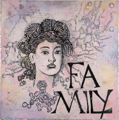
However, as I delved into the creative process, a transformation occurred. The emerging artwork shifted. What was meant to be girlish and commercial became edgy, reflecting a sense of unrest and anxiety. The initial pink style, born out of a desire to please the market, took on a new, frustrated meaning. It began to highlight the restrictions and societal pressures that limit personal growth for women—the need to conform, to maintain a specific appearance, and to be the “kind” caregiver at all times.
Rebellion Through Texture
As the artwork evolved over a year, I moved away from commercial ideals and began experimenting with textures. I added beads and embroidery, deviating entirely from the original intent. The direction became provocative; I introduced a striking contrast of black against soft pink, which symbolised a rebellion against the initial concept.
This feminine image for the Cheshire set no longer felt appropriate. Instead, the painting became about juxtaposition—representing the divided nature of individuals in a capitalist world. We often feel forced to compartmentalise our personalities, wearing one “pink” mask for society while hiding a darker, more anxious reality beneath.
The Central Figure
The central figure in ‘Family’ mirrors my own journey. Initially designed to emphasise beauty, she transformed into an unsettling and anxiety-laden expression of the pressure to take on family responsibilities and caregiving roles. By the end of the process, the painting was no longer a product; it was an honest confrontation of the anxieties faced by women in the UK today.